Caily — HIPAA-compliant communication platform for senior living (live at caily.com)
Caily — Two Years of Design That Could Not Ship
Two years of design work that couldn't ship. One month to production.
The challenge
Caily had two years of design behind it and nothing in production. The inherited file held roughly 1,500 design frames across mobile and web. Not 1,500 screens — every state of every screen had been drawn as its own artboard. Empty form, filled form, error state: three hand-made frames where one component with defined states would do. That is why the build had stalled. No frontend team can implement and maintain that surface, and nobody could hold the product in their head well enough to say what "done" meant. Underneath the volume was a second problem: five distinct roles shared one product with no shared system and no permission model in the design. Facility staff at three levels — member, admin, and owner — plus caregivers, family members, and a separate role managing communication across the platform. Each view had been designed independently, so the same record looked and behaved differently depending on where you opened it. The real question wasn't how it should look. It was why design kept producing artifacts engineering couldn't ship.
Fig. 01 — Who is on either side of it
Product imagery: Caily

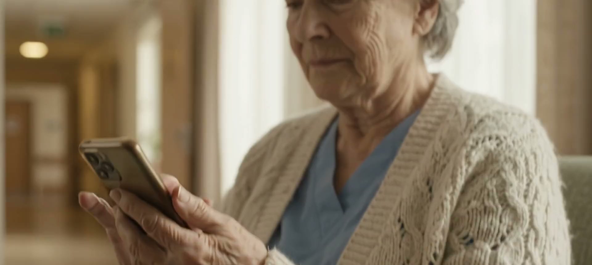
Care staff, mid-shift
The people handing off between shifts — on a phone, standing up, between rooms.
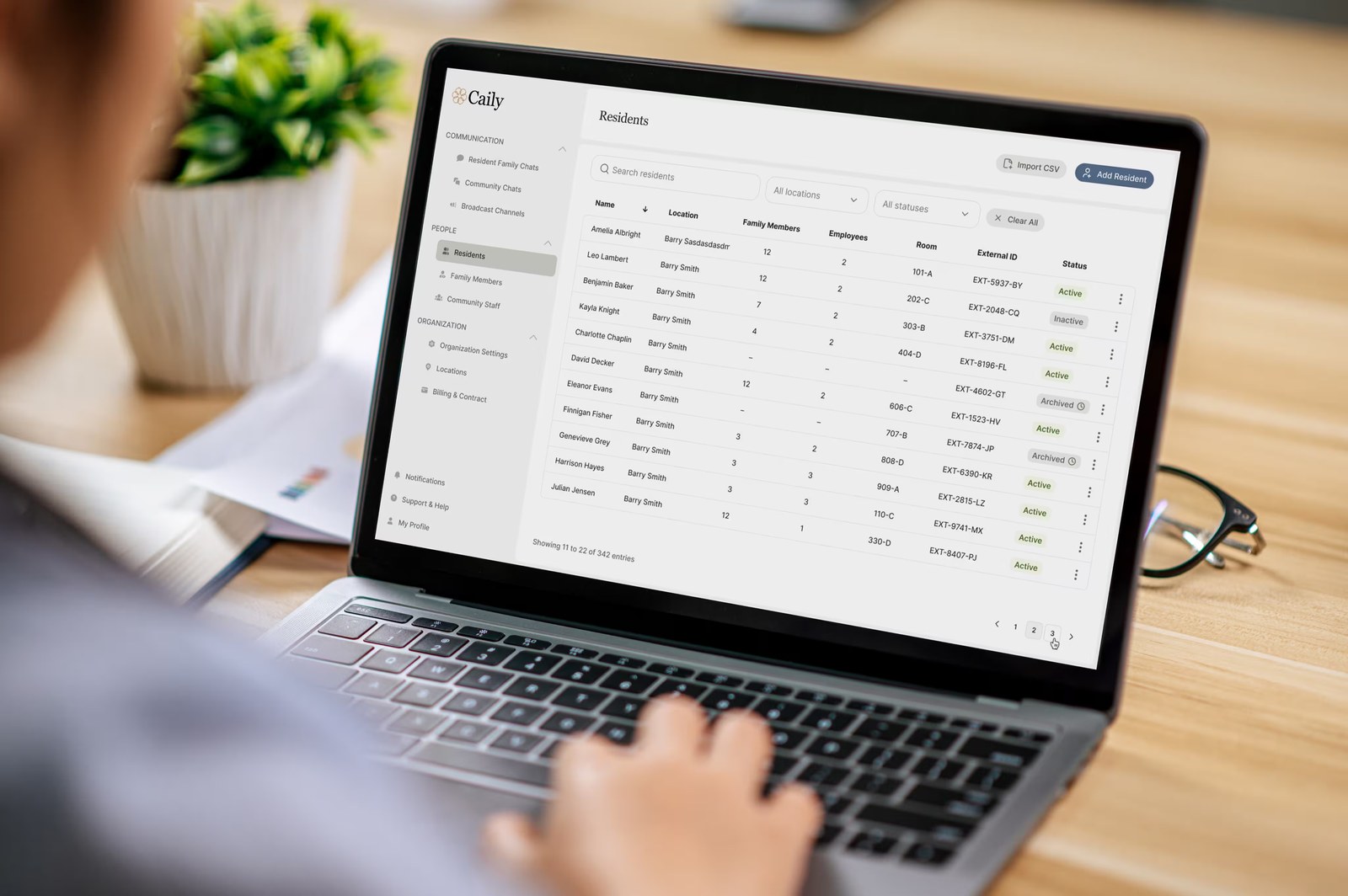
Leadership, in the office
The same records in the web app, where staffing and escalation are actually managed.
What I did
1. Cut the surface by 80%. I mapped the inherited frames against the actual user scenarios and found the same flows redrawn with cosmetic differences. Consolidating them into shared components with defined states took the product from ~1,500 frames to ~300 — same functionality, a fifth of the surface to build, test and maintain.
Fig. 02 — The same product, three audiences
Shipped — caily.com
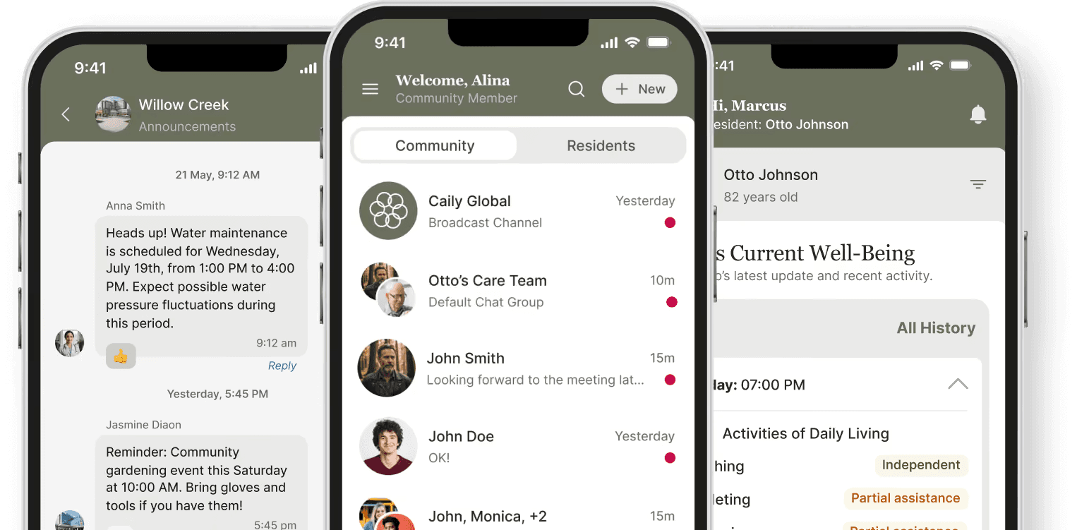
Announcements a community sends, the feed a member opens, and the resident view a family member sees. The same components, assembled from one system rather than drawn per screen.
Product imagery: Caily
Fig. 03 — The surface, counted
From the working file
3
Products in one file
Mobile, tablet, community web
~1,500
Frames across them
Every state drawn as its own artboard
5
Roles sharing one record
Three staff levels, caregivers, family
80
Design variables
Colour and system tokens, seven collections
That was the problem, not the achievement. Consolidating those frames into shared components with defined states is what took the build from stalled to shipping.
2. Audited against the API, not the mockups. Before redesigning anything I checked every proposed screen against what the backend could actually return. That is where the stall came from: fixing the visual layer without fixing the data model would have produced another two years of unshippable work.
3. Built the permission model into the design system. Three staff levels, caregivers, family, and chat management — one record, different visibility per role. HIPAA makes this a legal requirement, not a preference. Permission became a property of each component rather than a per-screen decision, so a caregiver's view and a family member's view are the same component under different access, not two designs to maintain.
Fig. 04 — One product, five roles, three surfaces
Shipped — caily.com
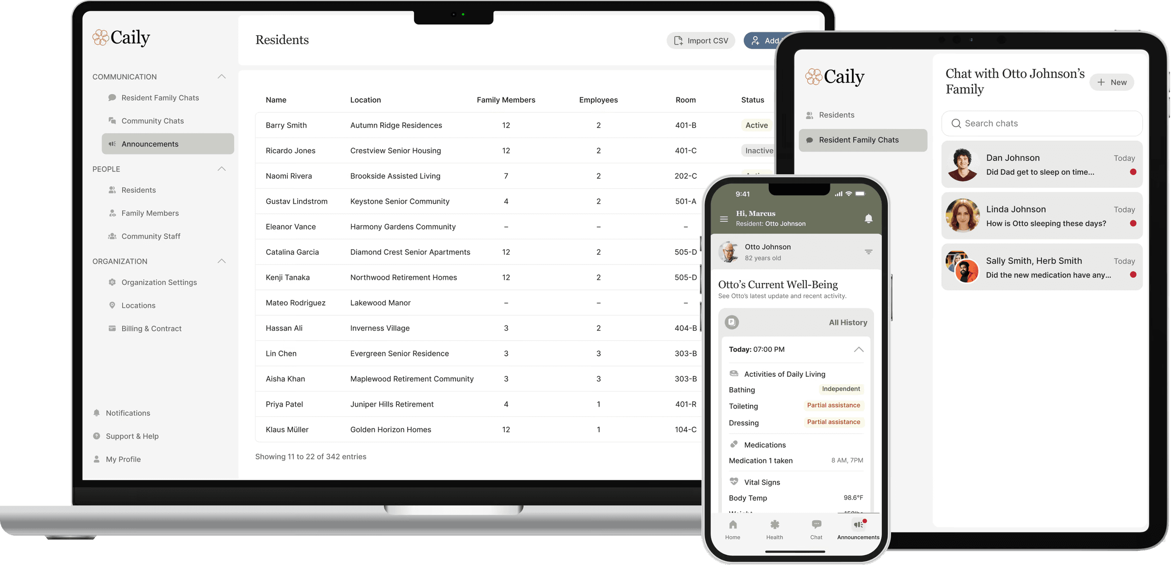
One record, different visibility per role — three staff levels, caregivers, family, and chat management. Permission became a property of each component rather than a per-screen decision.
Product imagery: Caily
4. Wrote design contracts with engineering. Component architecture agreed with the frontend team, so a screen is assembled from known pieces rather than interpreted from a mockup. That is what took the project from stalled to shipping in weeks.
The solution
The product went to production in about a month and is live at caily.com — after roughly two years without a release. Roles now run on one design system with permission built in. Engineering ships from components instead of re-interpreting mockups screen by screen, and ~300 screens carry what 1,500 frames couldn't.
What I’d do differently
I ran the API audit first and it saved the project — the existing designs described a data model the backend couldn't return, and no amount of visual work would have fixed that. But I presented it as a design finding, in design language, and it took two weeks to get the team to act on it. Framing it from the start as a delivery risk with a cost attached would have moved faster. The analysis was right; the packaging cost me time.